Make complexity
feel intentional.
The brand had to signal speed and accessibility without relying on the familiar visual language of generic bike-sharing products.
Loading project
000

MOBILITY BRAND / VISUAL IDENTITY MANUAL
01 / Overview
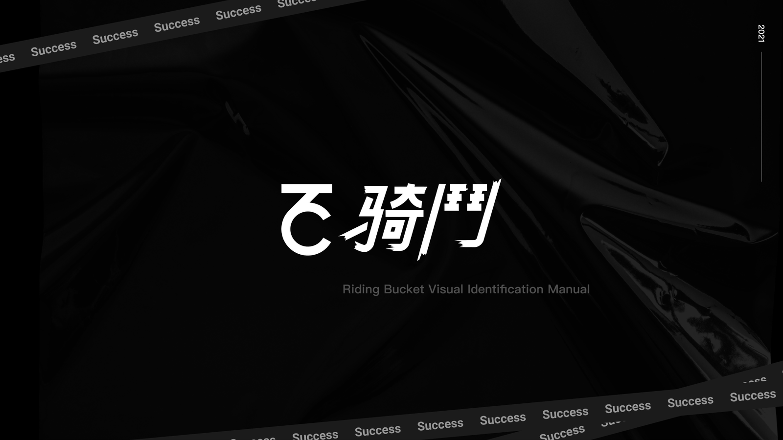
I led the visual identity for Riding Bucket, a mobility service requiring an energetic mark and flexible graphic system for product, campaign and street-level use.
02 / Selected frames
20 additional views from the full design system
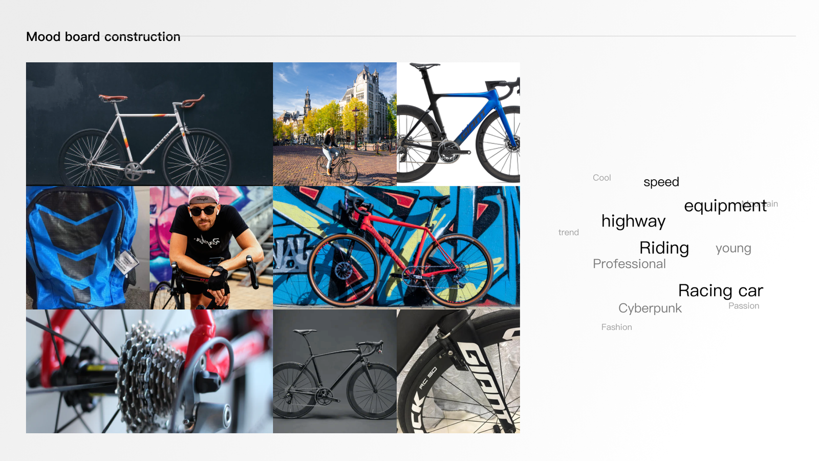
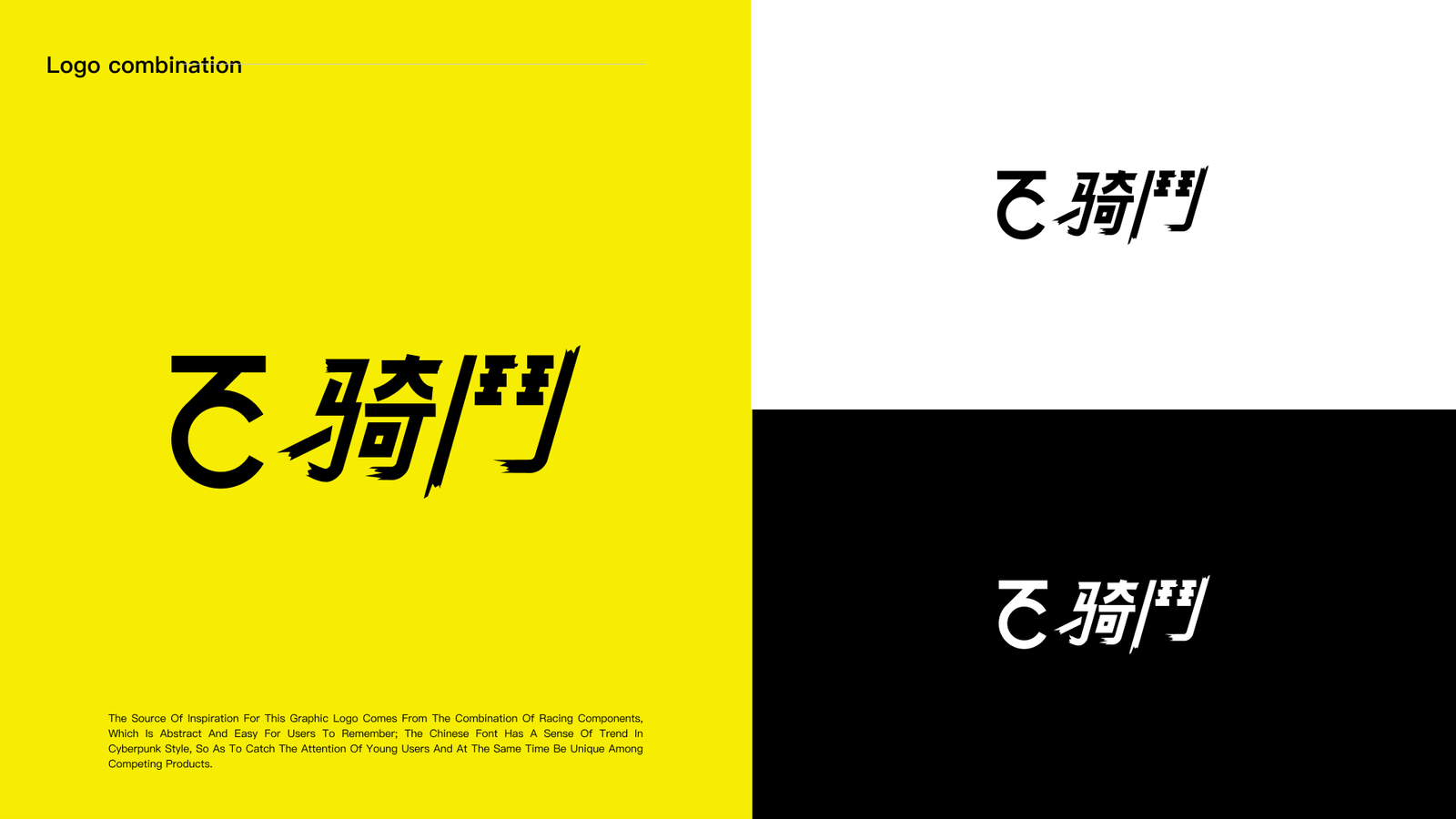
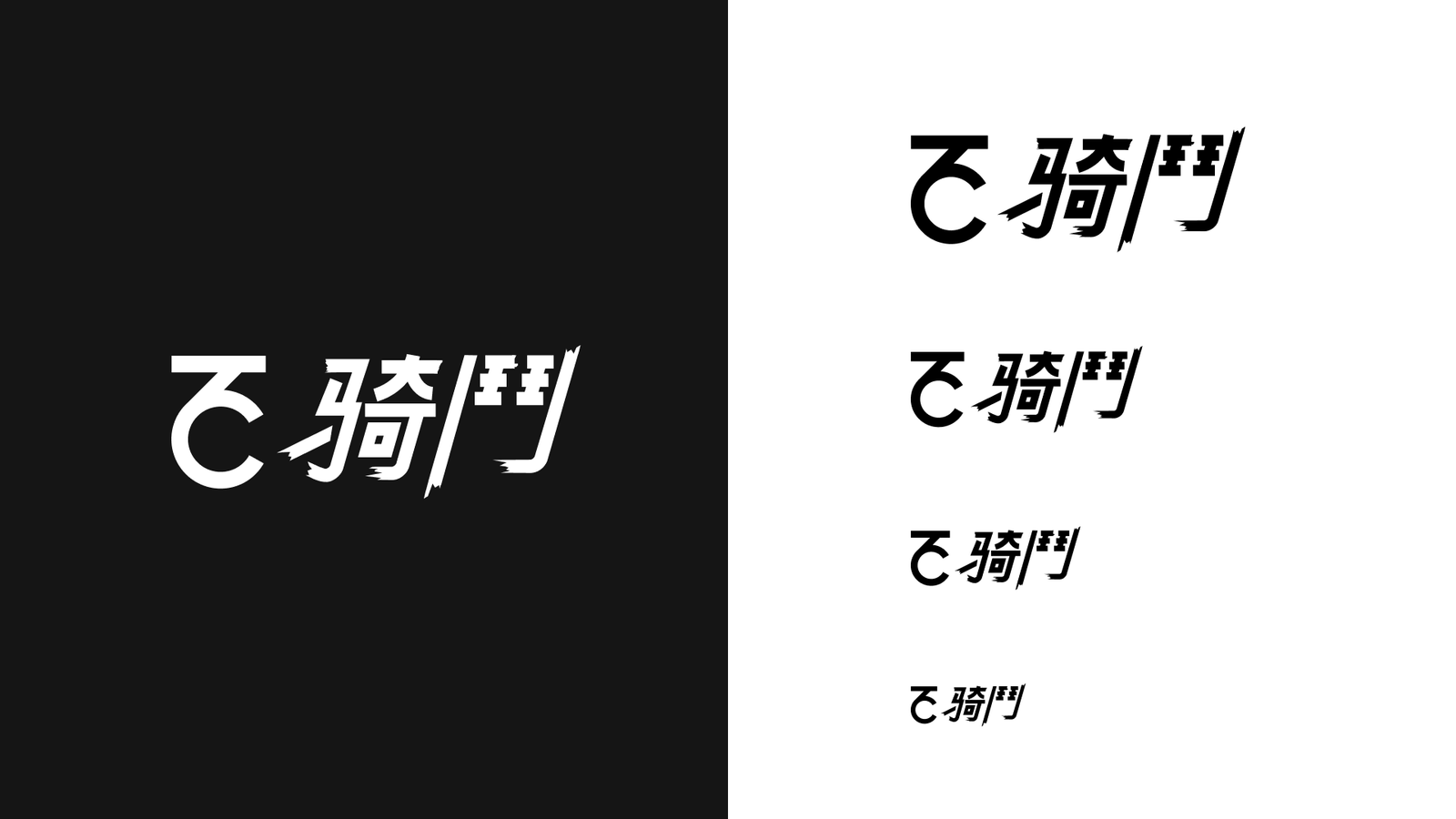
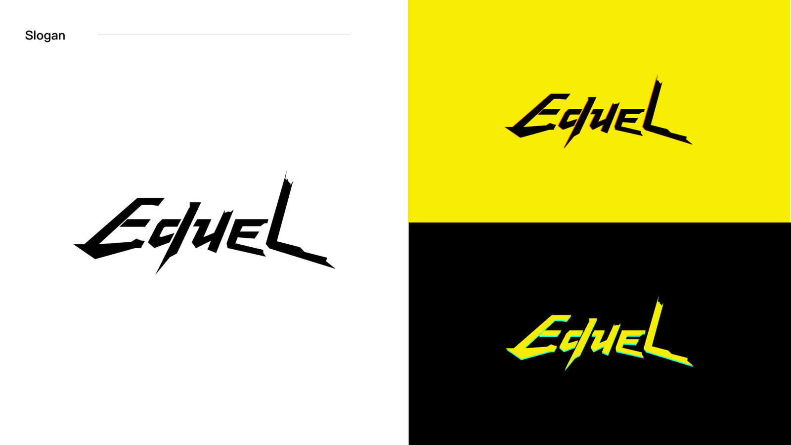
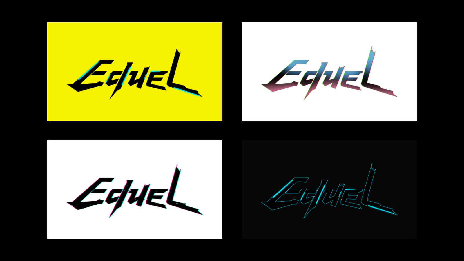

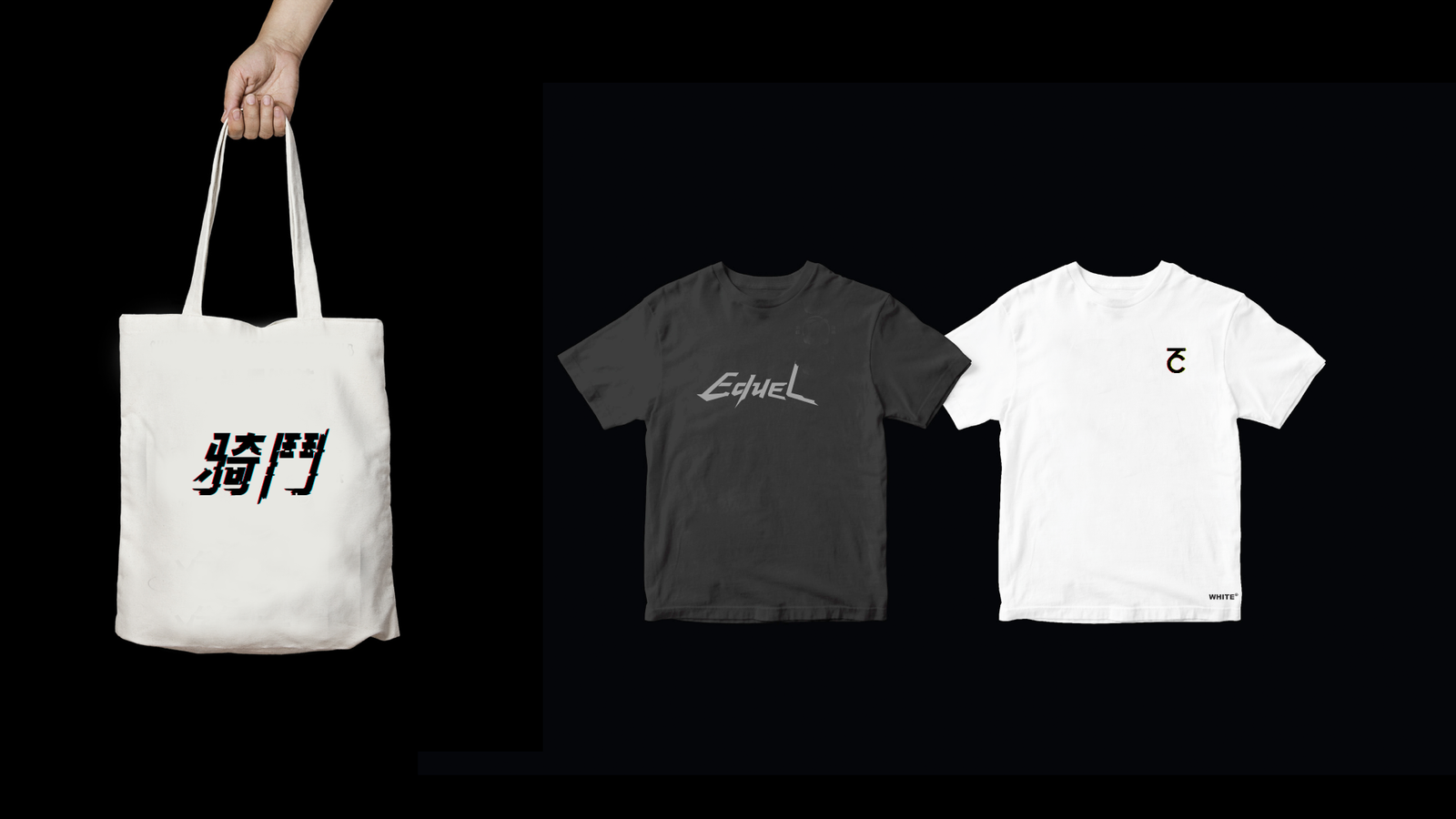
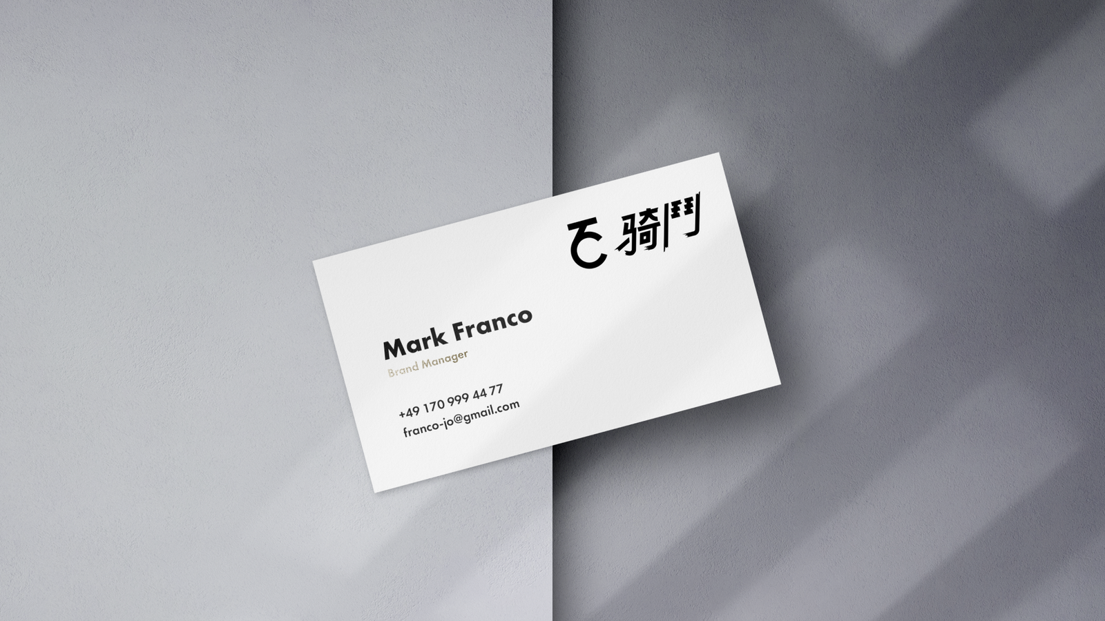
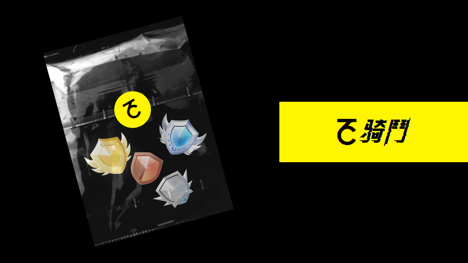
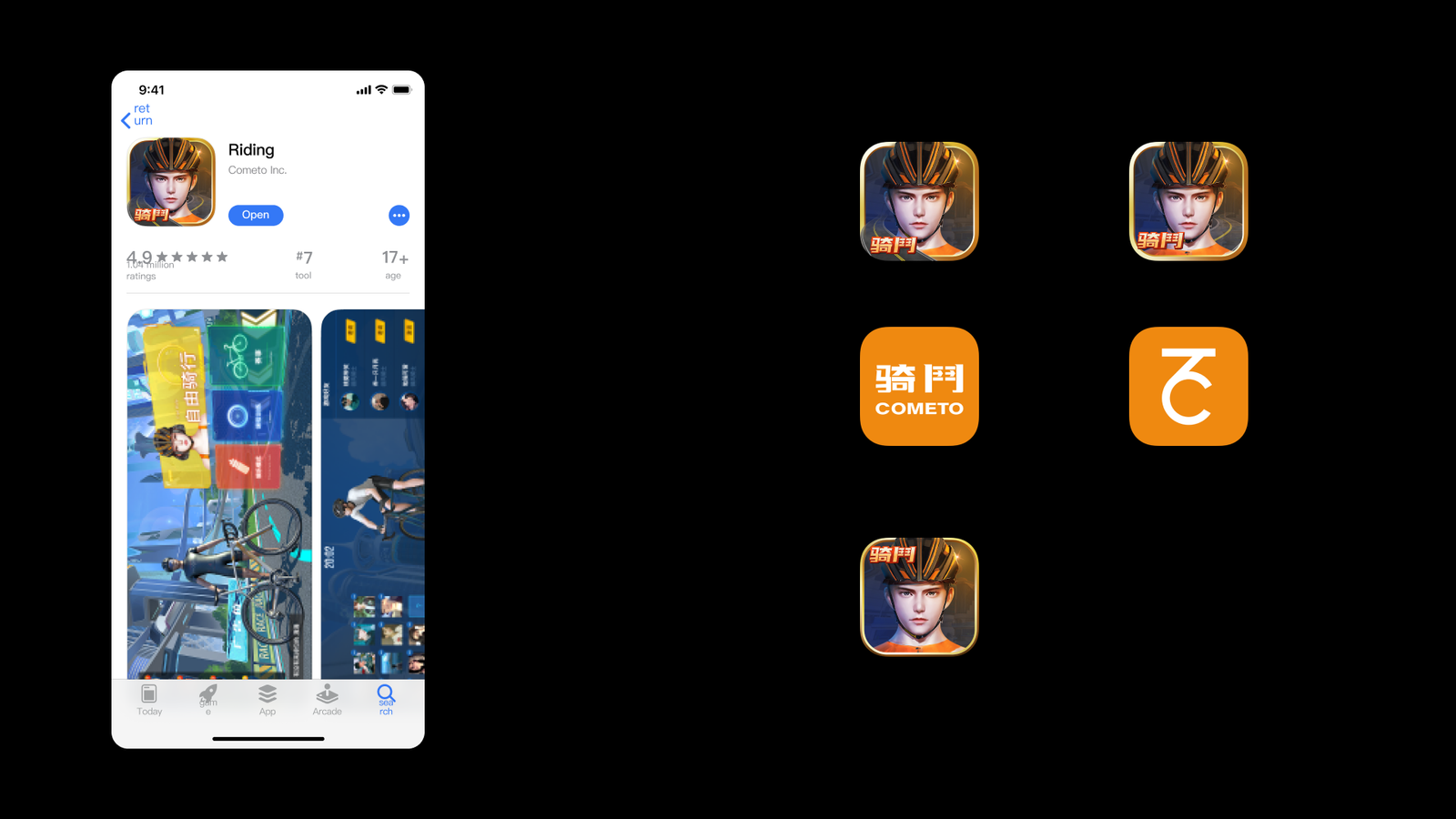

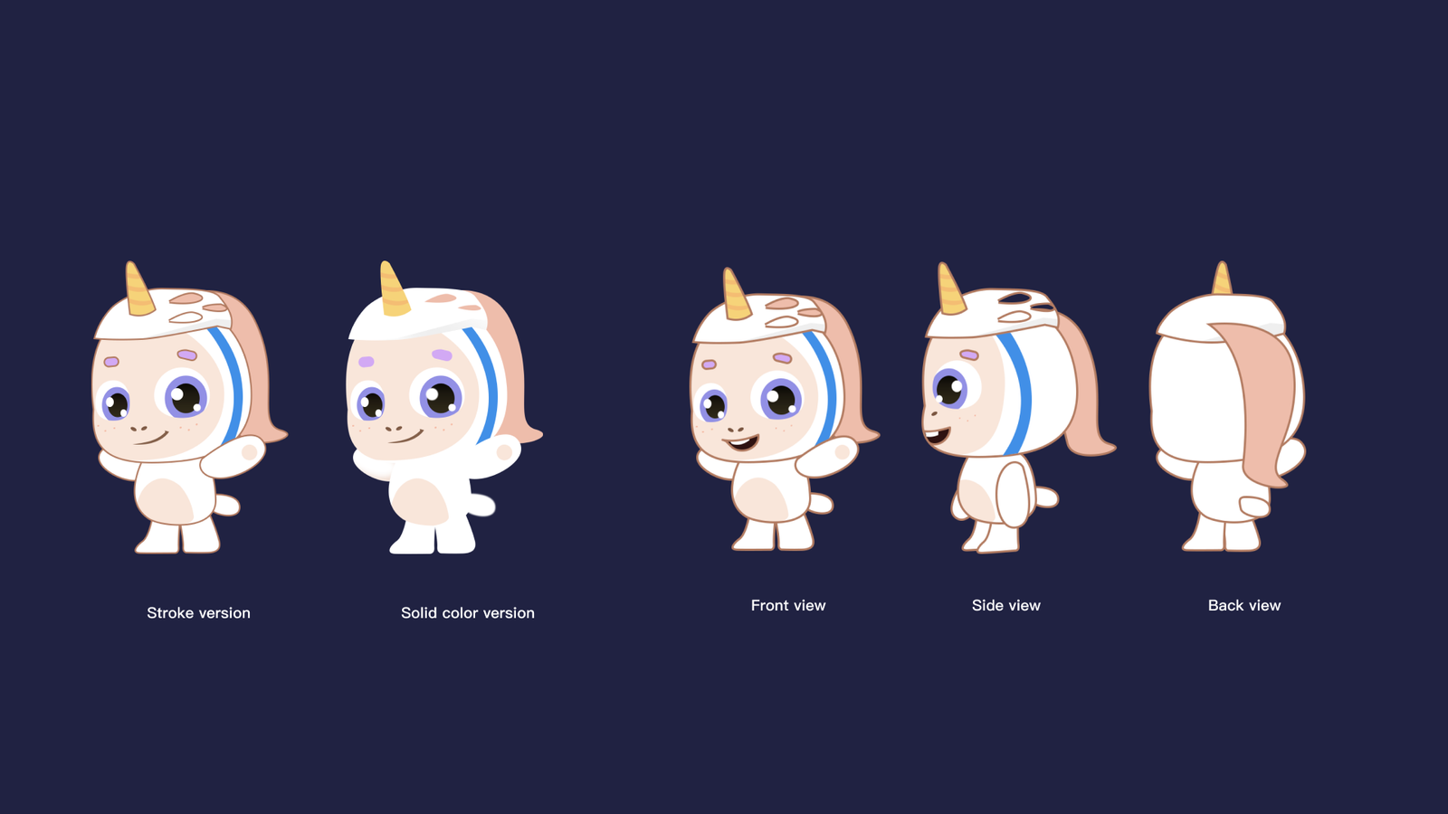

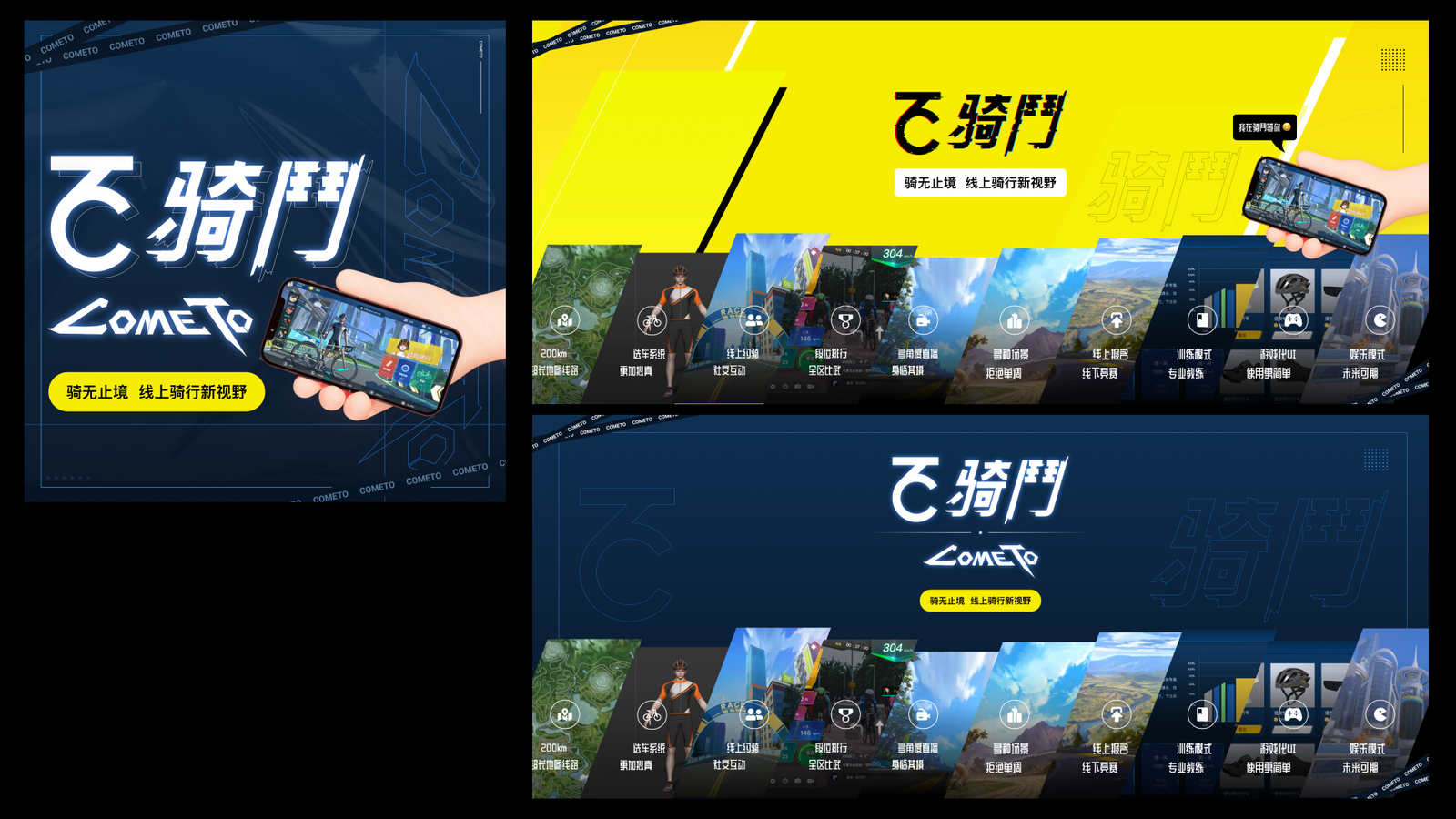
The brand had to signal speed and accessibility without relying on the familiar visual language of generic bike-sharing products.
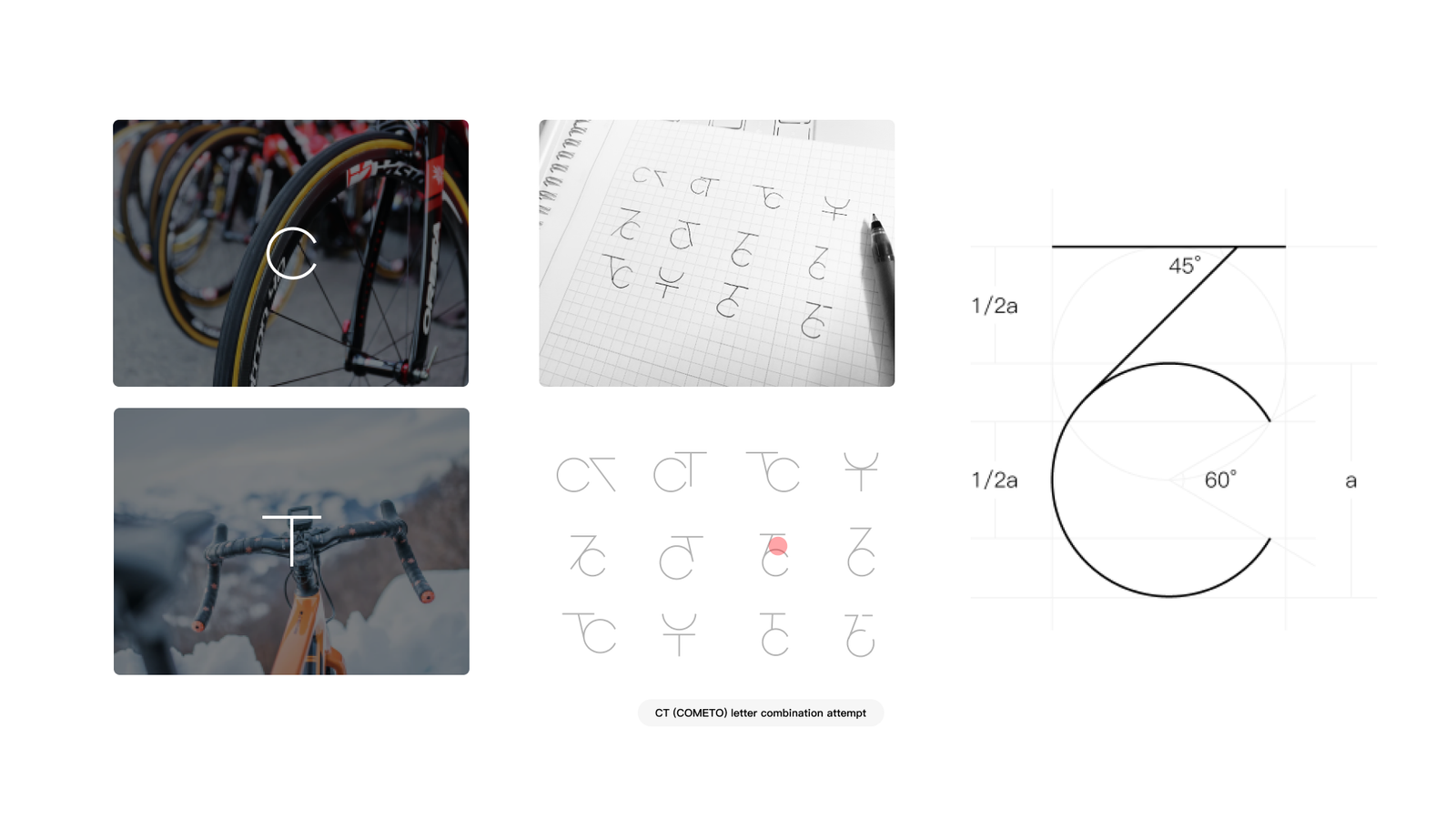
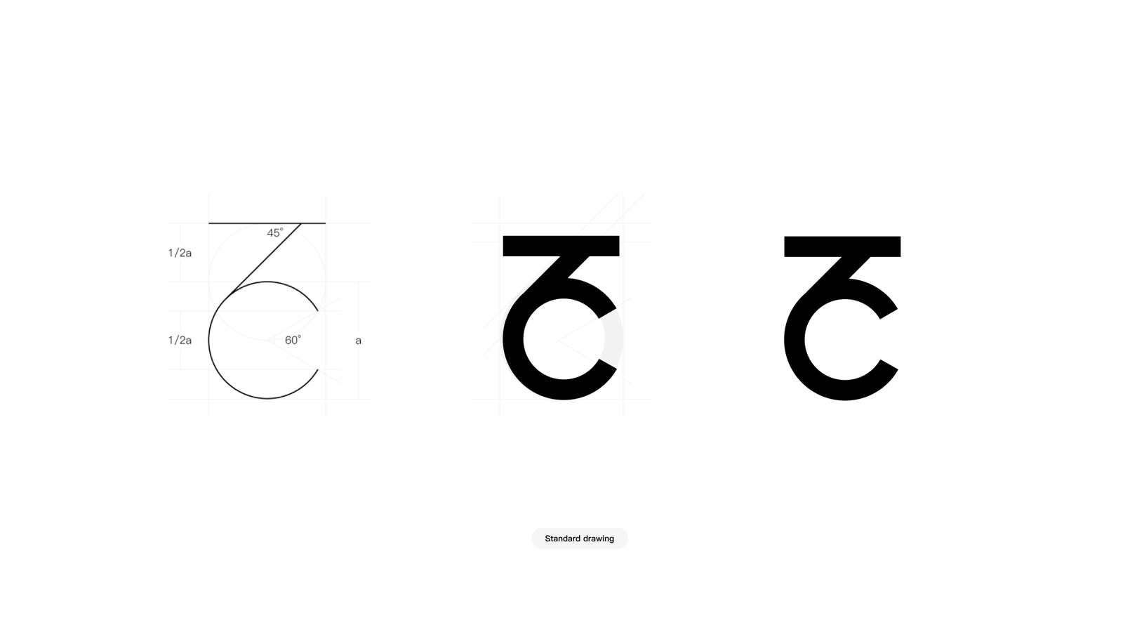
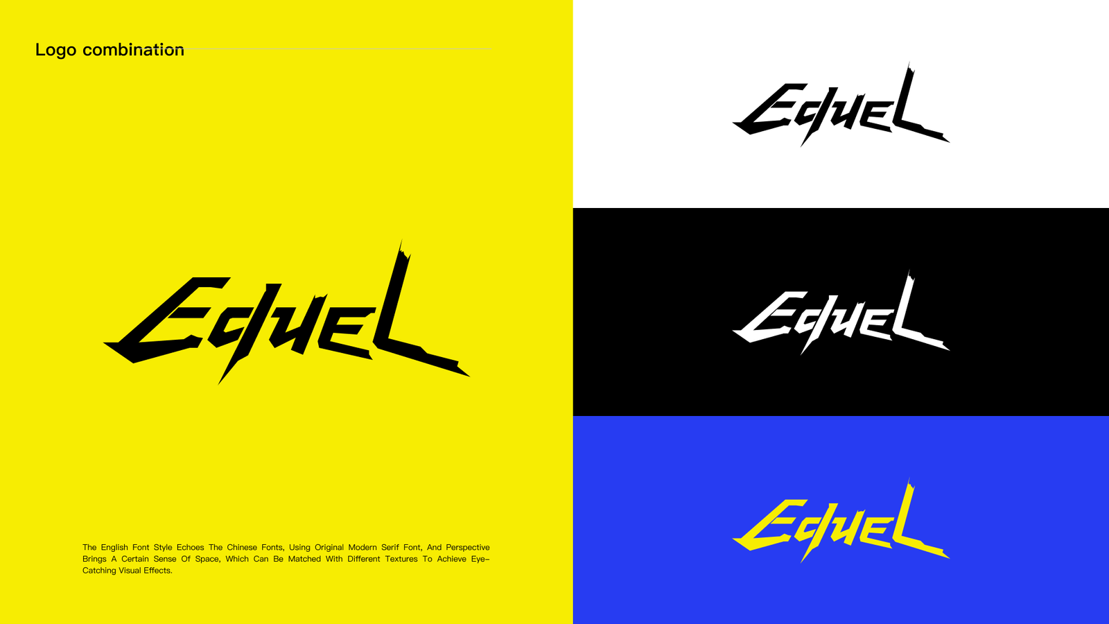
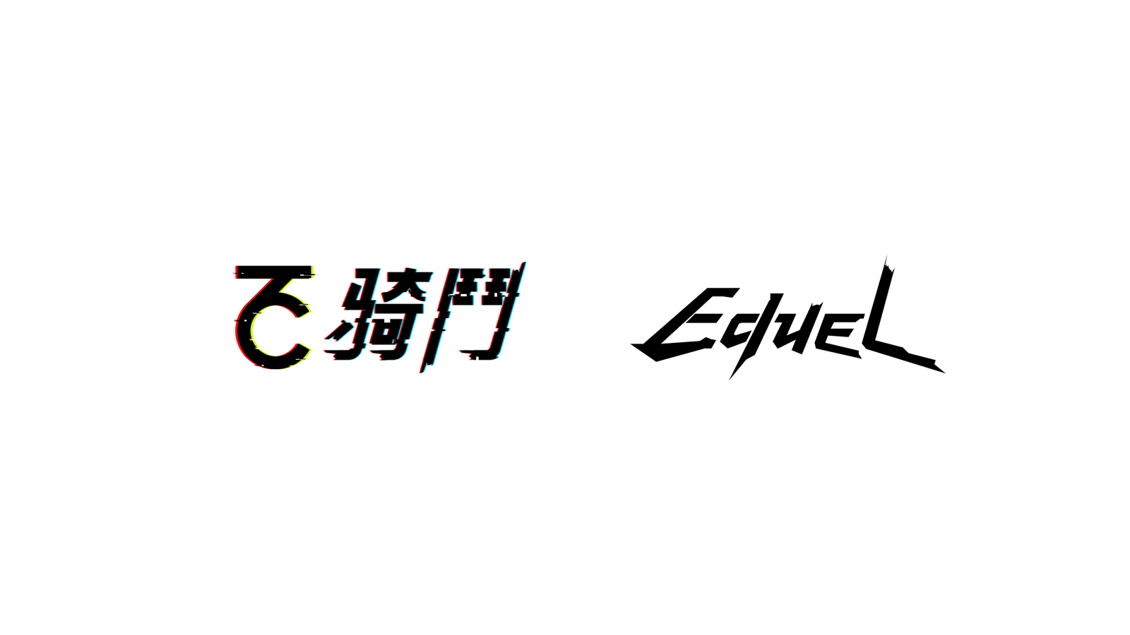
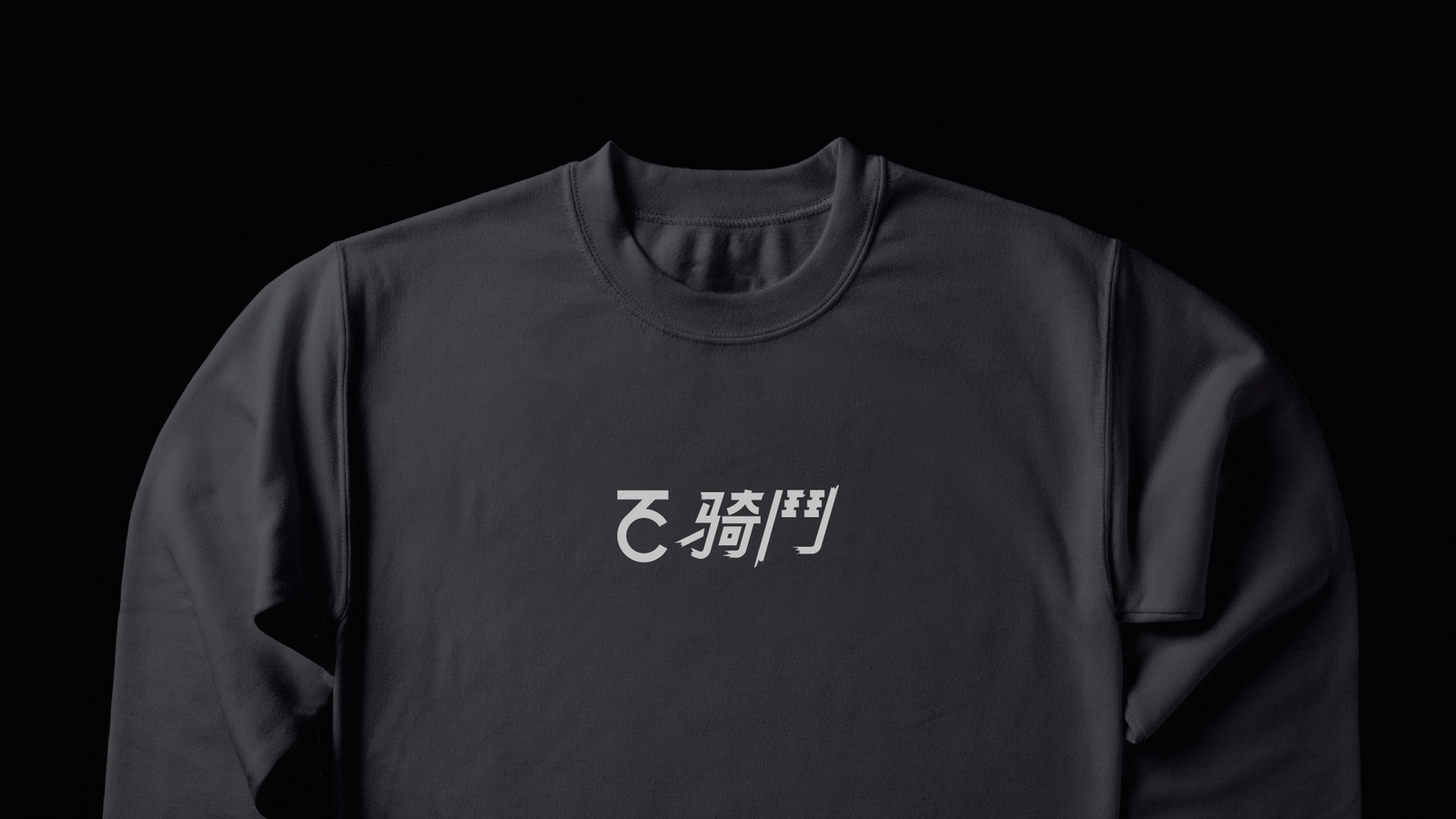
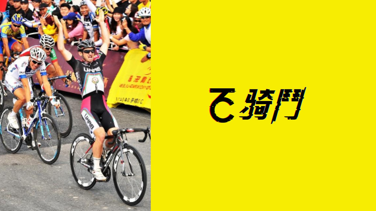
I combined a circular motion symbol with distressed kinetic typography and built a scalable black-and-white system for high-impact applications.
Brand systems · 2020